gather
Re-envisioning Cloud Storage with a focus on organization. Includes easy version control, group sharing and project management capabilities. Desktop Prototype | Mobile Prototype
Introduction
summary
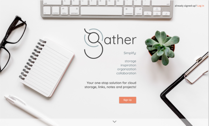
Gather is a cloud storage solution that gathers all your data, links and notes in one location and offers simplified, yet powerful organizational capabilities.
Desktop Prototype | Mobile Prototype
My role: UX Research, UX Design, Visual Design, Branding.
Deliverables: User Surveys, Competitive Analysis, User Personas, User Stories & Flows, Wireframes, Usability Testing, High Fidelity Mockups, More Testing, Prototype, More testing. Lots of Testing!
Tools Used: Figma, Photoshop, Illustrator, InVision, UsabilityHub, Draw.io, Pen & Paper.
The Problem
Come up with an idea for a new cloud storage service to target an untapped market.
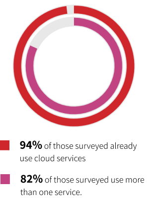
Research indicated that most people already use cloud storage services, with the vast majority using more than just one. How to find an untapped market then?
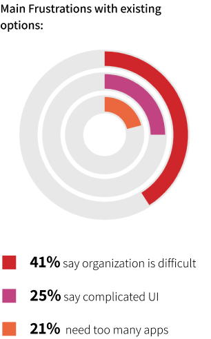
My research exposed two main frustrations with currently available options:
- Needing more than one application (for different kinds of data.)
- As functionalities increase, organization plummets.
The problem: how to increase and consolidate functionalities, while improving organization?
The Solution
Create an app that takes the basic functionalities of the most commonly used apps and combine them into one option for all kinds of data!
Gather offers storage for all file types (docs, links, notes, etc..) with advanced sharing capabilities that allow for “publishing” data publicly .
There is also the capability to organize data into “projects” without changing their stored location.
Document “snapshots” address the desire for version control.
My Process
user research
In order to gain better insight into user behavior, preferences and frustrations, I conducted an online survey utilizing google forms.
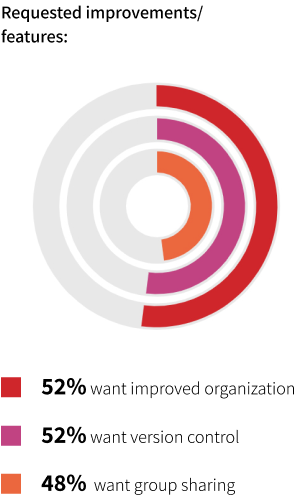
Though this survey was mostly instended to gain insight into general usage, I also proposed some of the features I had been originally envisioning and it emerged that these features weren’t really a priority.
It seemed users wanted to resolve frustrations with current options more than they wanted new features.
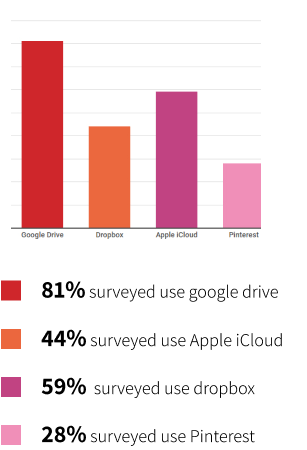
User Survey Insights:
More detailed analysis from my survey can be found: here
Competitive analysis
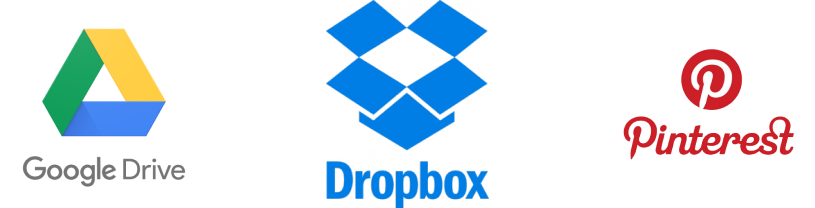
After performing some initial broad research, I narrowed the competitors that I wanted to analyze more closely down to Google Drive, Pinterest and Dropbox.
Results of my analysis:
Google Drive: dominates the cloud storage landscape. It offers a lot of functionality especially for creating content. Though it seems to have a minimal interface, with very few design elements, the interface is very cluttered and confusing with way too much going on. Moreover, users tend to use separate applications, like Kep for notetaking and Photos for images. These types of data are not integrated with the other content. Also, organization and display of data are not intuitive.
Dropbox: focuses on uploading and storing content. Though they recently introduced Paper, to compete with Google’s content creation functionalities, they are known for storage and better organization. While dropbox has a far more intuitive interface and organization system, it doesn’t have the added functionality that Google offers and it’s quite expensive if you want to add more than a minimal amount of content.
Pinterest: differs from Google Drive and Dropbox in that its focus is on linking to “found” content. It is used primarily for bookmarking images on websites, to be used for inspiration and reference. It has limited organizational capabilities and doesn’t offer storage solutions for uploaded files or content creation.
More detailed analysis from my competitive and SWOT analysis can be found: here
personas
From my analysis, three types of users emerged:
- Tech savvy users, who want advanced organization, communication and sharing capabilities
- Social media savvy users (though not necessarily tech savvy) who want one app to handle all types of data, communication, media and ideas.
- The busy professional who is generally not tech savvy, but likes technology that is easy to use and makes life simpler and less complicated.
Persona #1: Steve - programmer "I don't want to have to talk to anyone"

Motivations -
He currently uses Google Drive and Keep for both work and home. He does a lot of collaboration with co-workers, but not in person if he can help it. He would like better collaboration capabilities like group sharing.
Frustrations -
Can’t easily tell what files are shared with who. Hates having to interact with people to ask them to do something related to a shared file or folder. Can’t easily give notes or comments.
Persona #2: Kendall - blogger “I have way too many apps and don’t know what is where”

Motivations -
She currently uses Google Drive, dropbox, keep, pinterest, pocket and evernote both professionally and personally. There is a lot of overlap between her personal and professional life and she needs to access everything from everywhere. She wants all her data in one place and ORGANIZED!
Frustrations -
She hates having to jump between platforms to find files or share with people or the public. Most of the apps she uses have a very confusing interface. She can’t easily tell what she has shared with who and who has access to what.
Persona #3: Jennifer - professor “I wish I had an administrator at home”

Motivations -
She uses Google Drive, Dropbox and Apple iCloud for both work and home. Collaboration is an important feature for her professionally and personally for her joint household. She loves having an administrator at work who keeps everything organized and would like some project management functionality for her household.
Frustrations -
Her personal documents are unorganized and all over the place. She just doesn’t have time to keep track of everything. Wishes everything were in one place and she had more controls over sharing and organizing.
user stories
With these personas in mind, I compiled a list of User Stories to determine the types of tasks that would be included in this product. High and medium priority tasks that define the minimum viable product (MVP) are:
- As a new user I want to
- create an account
- As a returning user I want to
- log in to my account
- As a general user I want to
- upload a file
- upload a folder
- create a new folder
- move a file to a folder
- save a link
- view my saved link
- search for a file
- create a new document/file
- share a file/folder with an indivdual/group
- see shared files
- organize my files into projects
- create tasks
- create notes/lists
- add a contact
- organize my contacts into groups
- control versioning of my data
Full list of user stories available: here
user flows
Based on my low and high priority user stories, I created user flows for the MVP. Starting with sketches:
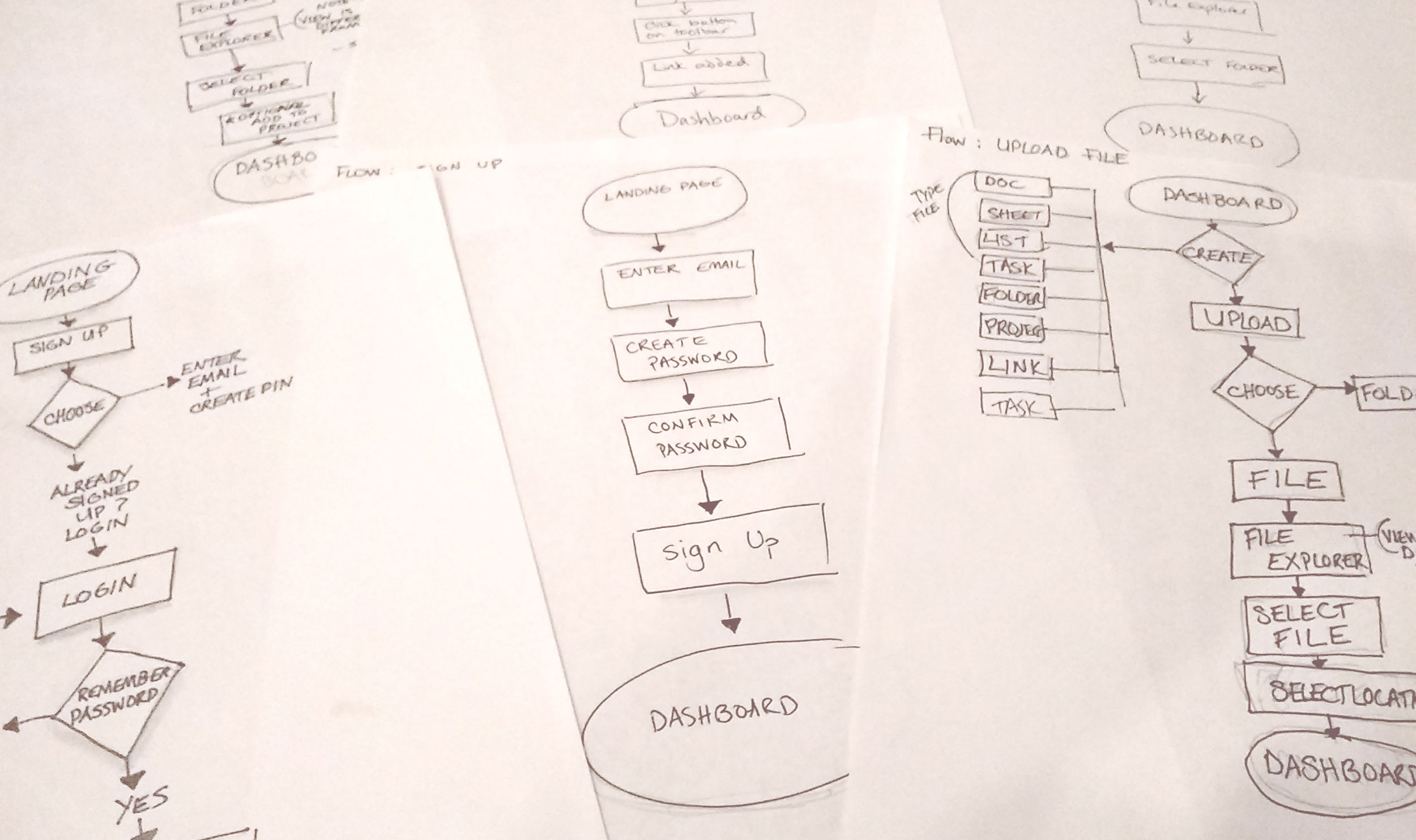
and moved on to draw.io for final flows:
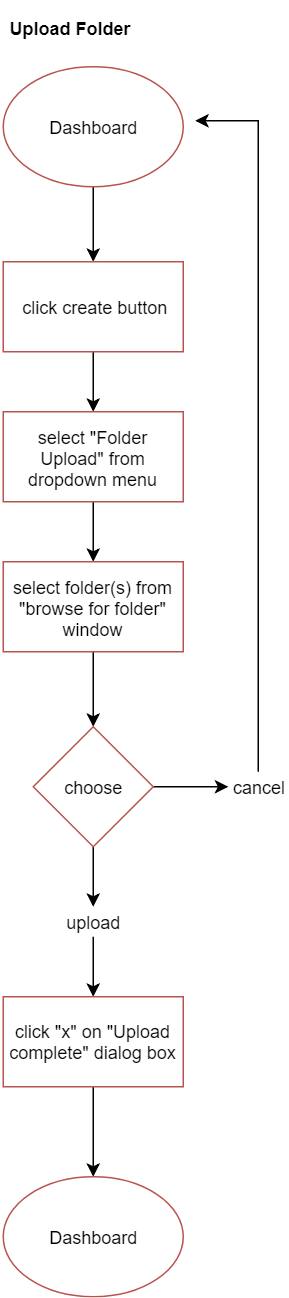
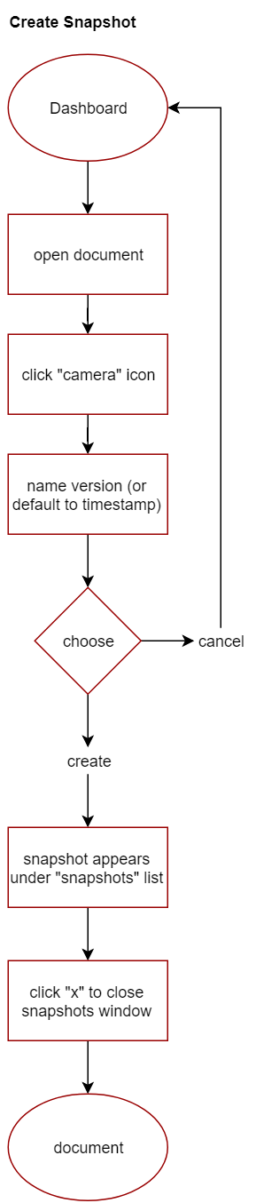
All user flows: here
These flows informed a preliminary: Content Strategy and Sitemap
wireframes
Using my content strategy document and sitemap as a guide, I began sketching wireframes for each user flow:
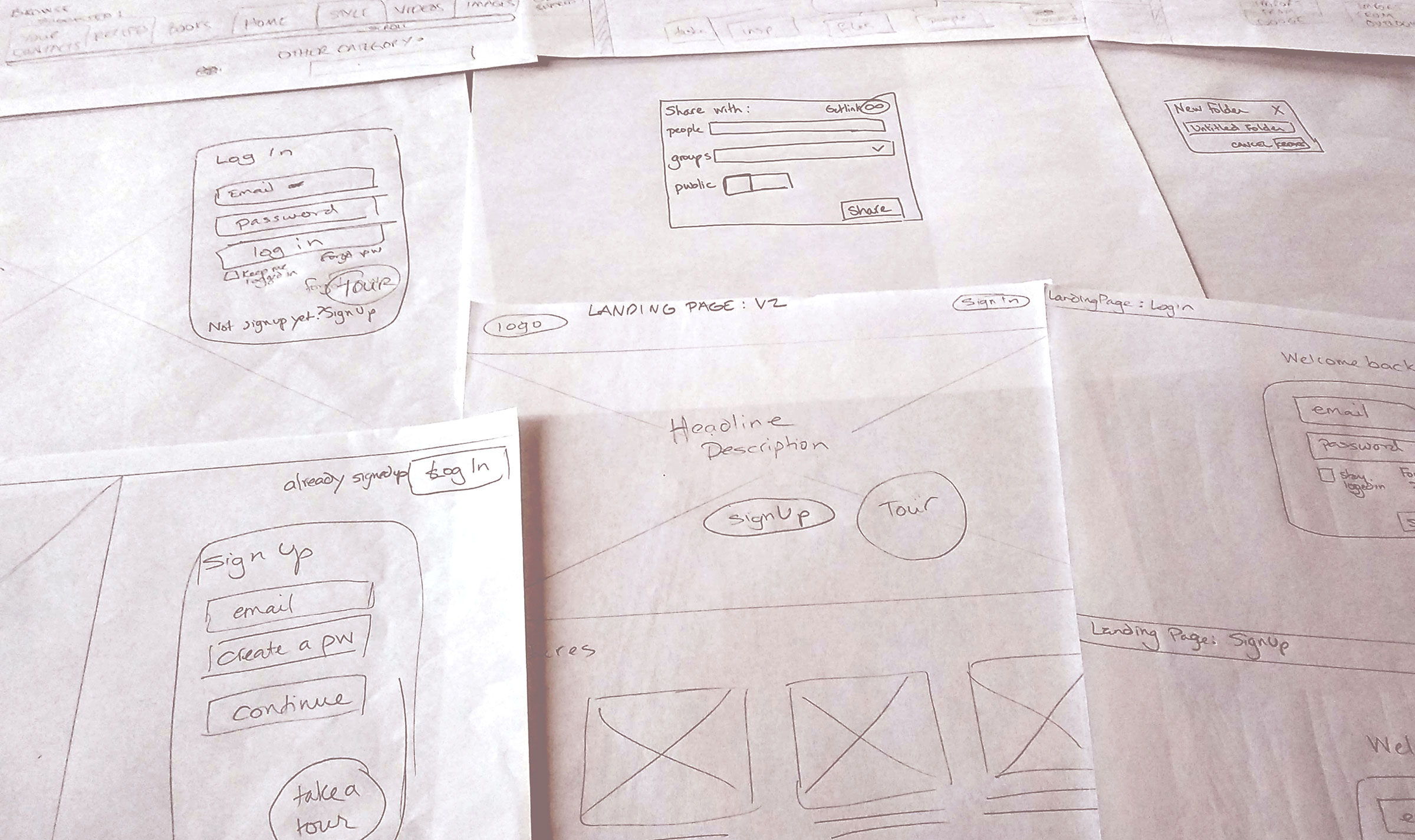
Early wireframe sketches: here
Seeing everything mapped out visually, encouraged me to make some structural changes in order to facilitate better organizational possibilities.
- Instead of separating “saved” content (i.e. links, bookmarks, data that is stored in another location and just referenced) and “stored” content (i.e. files that are uploaded or created and actually “live” in this repository) into separate sections, I decided to integrate all types of data and focus on creating varying ways to view or organize these files and links.
- In each section, I offered additional opportunities for filtering information to make things easier to find.
This led to an early set of digital wireframes, created in Figma.
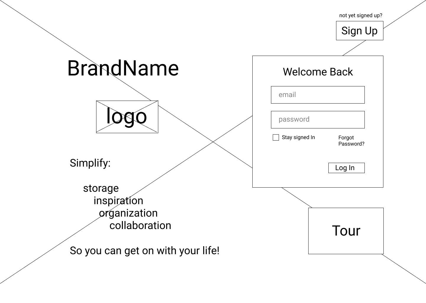
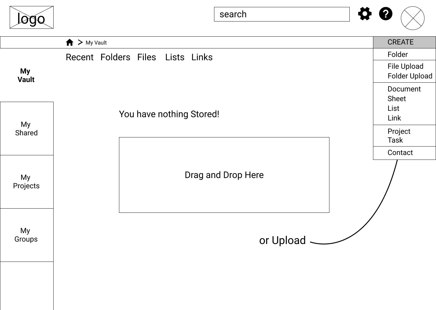
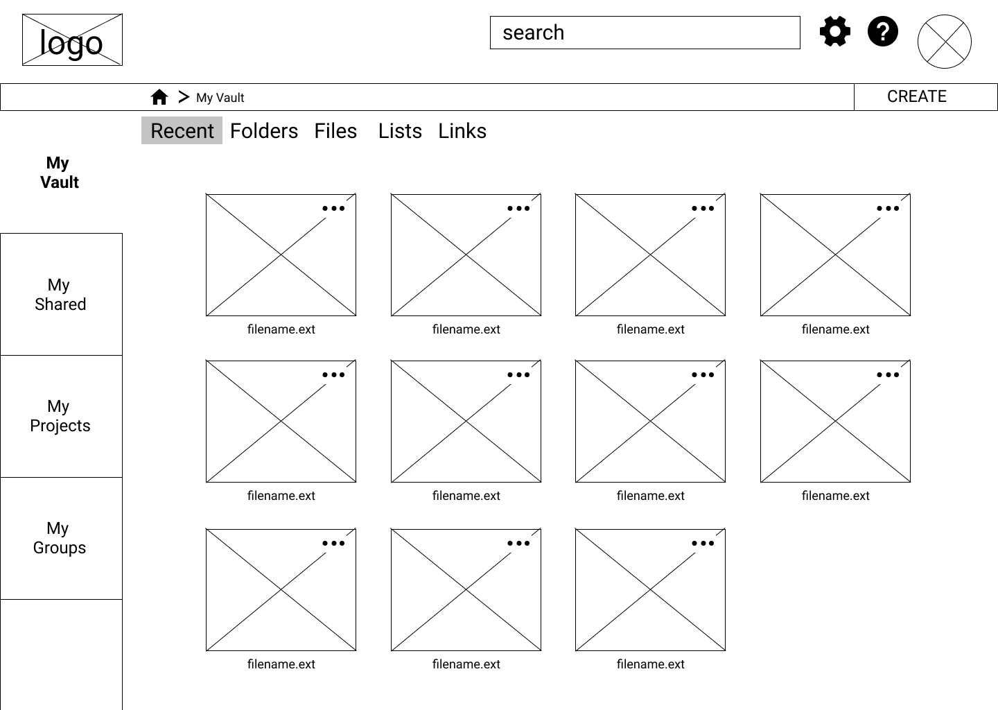
Preliminary digital wireframes: here
prototype 1 + testing
I imported my wireframes into inVision to create a lo-fidelity prototype for testing. I conducted a series of Usability Tests utilizing the prototype and a test script.
Tests were conducted both in person and remotely, using zoom. Feedback indicated that a few changes, predominantly to naming and language, should be made.
- My original plan to put the “sign-up” screen on the landing page (like dropbox does) was a little too aggressive for my users. Feedback suggested they should be gently “sold” some information about the product before assuming they want to sign up.
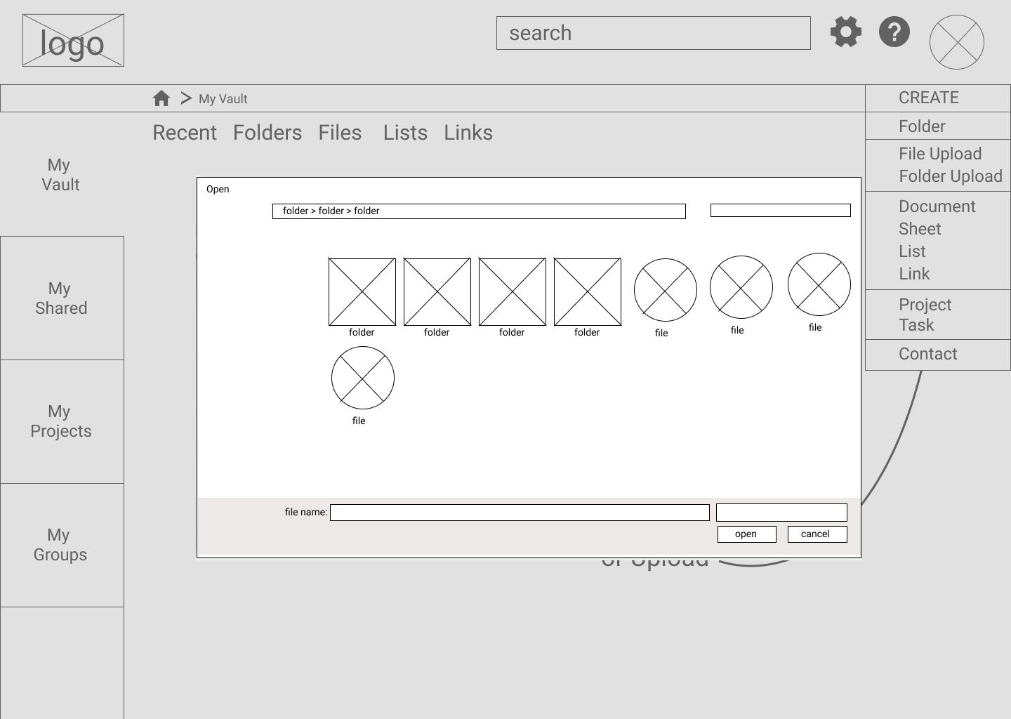
- On my file browser for uploading, I should change the word “open” to “upload”.
- I should consider changing “Create” to “Add”, or make some alteration to my design that lets users know that this button is the main place to add anything to the site.
- I should increase the size of my fonts to make them more readable.
Summary of findings from preliminary Usability Testing: here
branding
Step 1: Logo and Style
After making many lists and brainstorming a number of ideas, I decided on the name “Gather.” The fact that gather was a verb rather than a noun suggested taking action.
Gather definition:
- Come together; assemble or accumulate.
- Bring together and take in from scattered places or sources.
It also has an implied social component, an opportunity to share.
In order to minimize clutter and to present a feeling of ease and order, I chose a very minimal and clean style.
Full Branding Summary: here
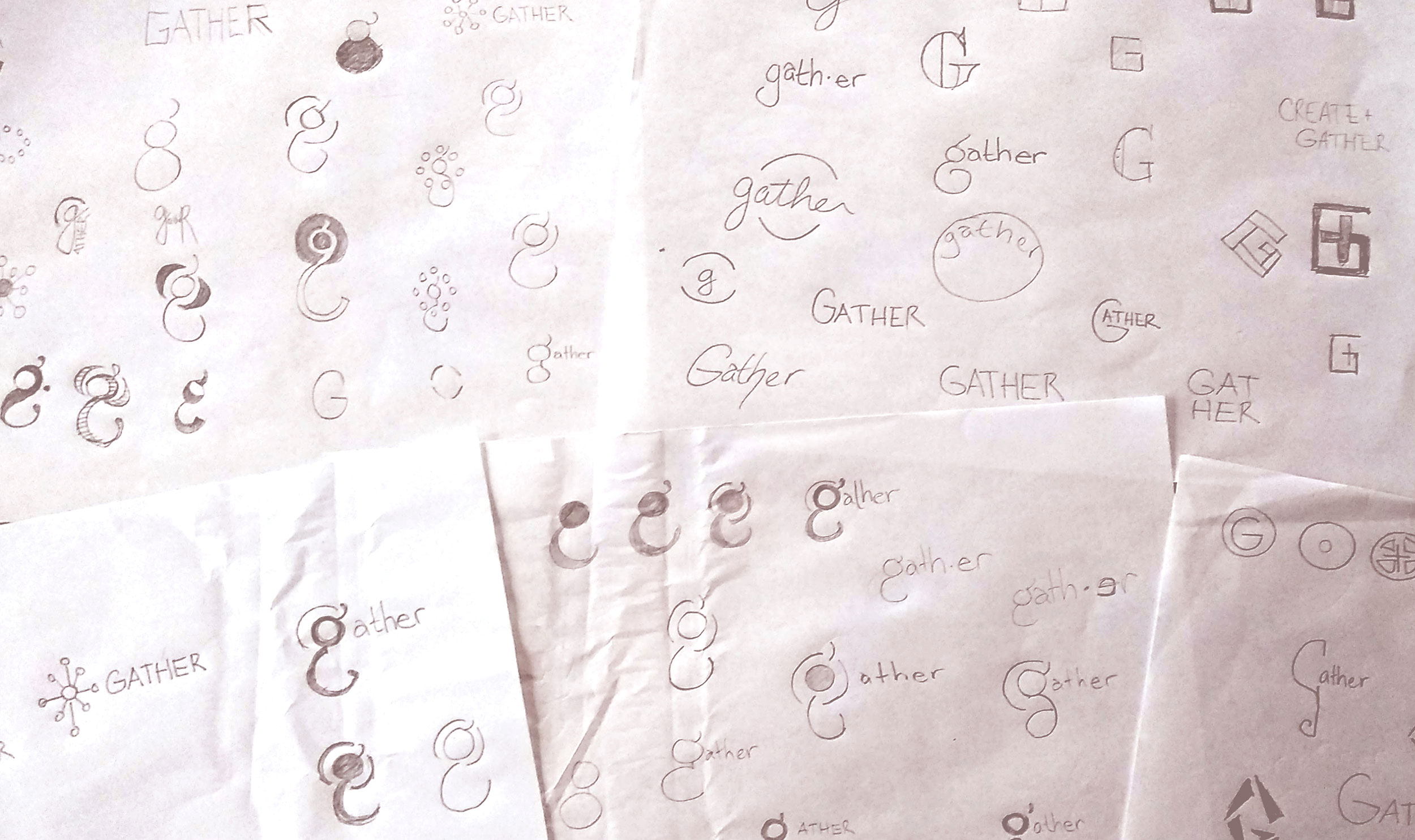
With the name settled and good sense of the “feel”, I moved on to sketching for a logo:
All sketches, mind maps and brainstorming lists: here
Preference tests for my initial digital designs indicated that I was going a little too “crafty” or “heavy” in my design and this did not align with the branding goal of minimal and modern.
Original moodboard: here | Revised moodboard: here | Preference Test: here
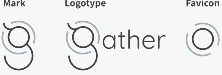
More iterations and testing, led me to a final, streamlined logo and style:
Step 2: Style Guide
My style guide details all design choices including typography, color palettes and iconography. Again, the basis of my design was keeping everything as clean, simple and minimal as possible. The interface is mostly white and grey, with little pops of soft tertiary color when accentuation is needed.
Color
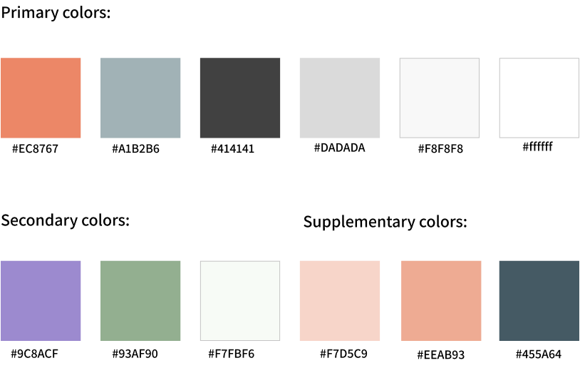
Typography
I used three sans-serif font families, for a clean, modern and geometric look and feel.
Iconography
I used many icons from the open-source icon set ion icons, with a few modifications where lines needed to be simpler and cleaner.
Full Style Guide: here
hi fidelity mock-ups
Applying the principles of my style guide to the wireframes I generated initial screen mockups.
Desktop Screens v01:
Mobile Screens v01:
preference testing
Using usabilityhub.com and slack, I conducted a series of preference tests on my early mock-ups.
Test #1
Which mobile toolbar is most effective and gives sufficient information?
The most popular choice was B. Users indicated that they did not need to be reminded on every screen which app they are using, and keeping the toolbar simple and less cluttered is more effective.
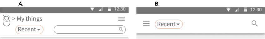
Test #2
At the very top of the screen, which design is best for indicating the chosen filter?
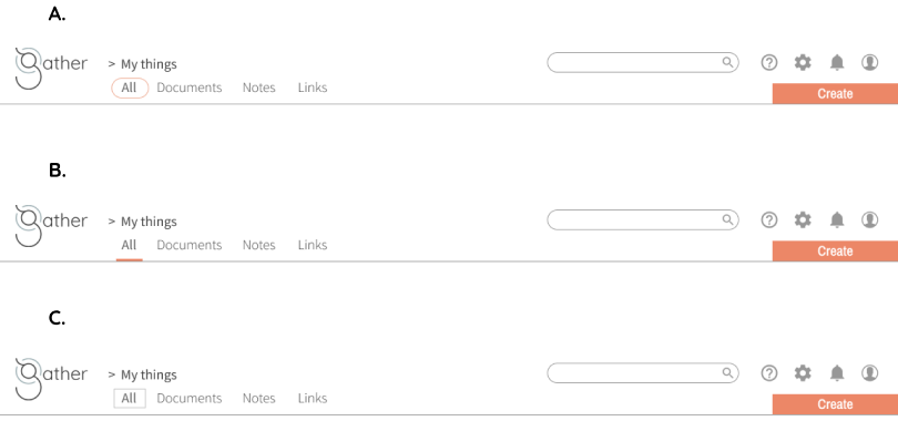
Though A. was my original design, B. was chosen by 100% of my test participants.
Test #3
Which bottom navigation for mobile is most effective?
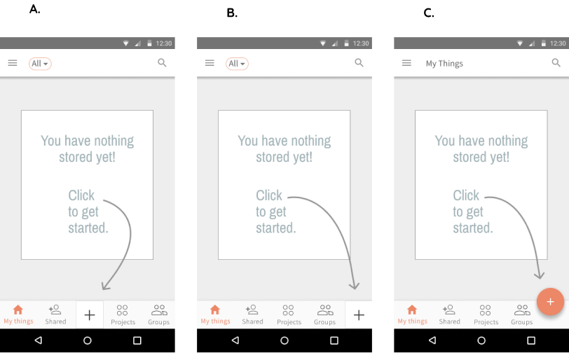
The majority of users chose C, indicating that the orange button stood out more and distinguished it from the other options, which are essentially about location rather than action.
Takeaway: These preference tests were a valuable lesson in the delicate balancing act of keeping things simple, while also providing sufficient information and cues.
Mock ups v02
The results of my preference testing, along with some suggestions from senior designers led to a second round of mockups. Below are just some of the implemented adjustments.
Change #1:
Progression of mobile bottom sheet (and icons/folders.)
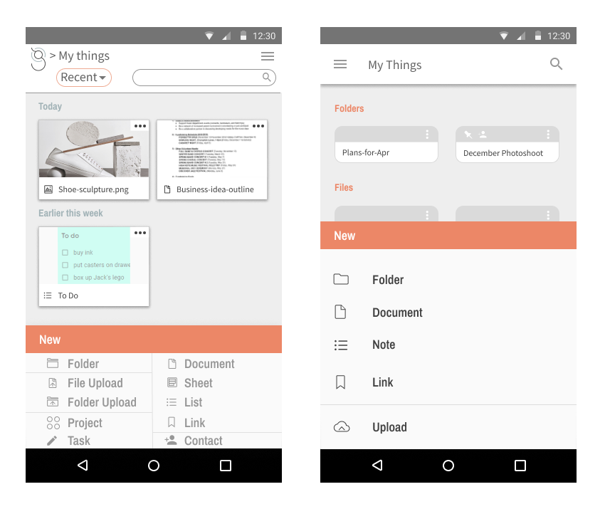
Originally, I was trying to offer too many options on my bottom sheet. I wanted maximum functionality. But, tests showed that users had trouble finding what they were looking for. I had too many options and I was also not leaving enough room around the different options.
I decided to stick strictly to the “Miller’s Law” recommendation of +/- 5 items at a time and reduce some immediate functionality, in favor of clarity. I also created a larger sheet for more “breathing room.”
Change #2:
Progression of desktop “create” menu:
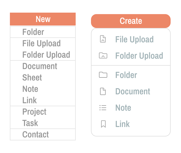
I decided to similarly reduce the options on my desktop menu.
Again, it was a decision to sacrifice some immediate functionality in order to minimize cognitive overload.
More usability testing
With these design changes applied to my prototype, I went into a final round of Usability Testing. Though all participants generally found it pretty straightforward to perform the requested tasks. The patterns that warranted some revision were:
- The landing page does not clearly show that the site is more than a competitor to google drive. The fact that it aims to consolidate facets of applications such as pinterest/pocket, keep and asana also, does not seem to be readily apparent. Action item: Content needs revising.
- It is not obvious that the landing page scrolls to further information. Action item: add indicator to signify there is more reading below the fold.
- It is not obvious when you first log in that you would click the “create” button to upload files. Action item: revise empty state content and create onboarding tour.
- Participants expect a toolbar add-on for saving URL/link, no one wants to type or paste a URL in (I had this functionality in original wireframes, it was just hard to prototype so left it out). Action item: Bring back toolbar extension feature to “save link.”
- Screen/button for “adding a project” and “adding files to project” are too similar. Action item: use color to distinguish these two from each other.
- The information about “My groups” did not make it completely clear that this section was about contacts and not about groups of files. Action item: review wording and create onboarding tour.
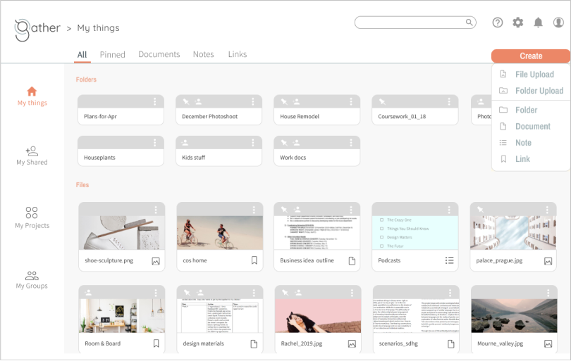
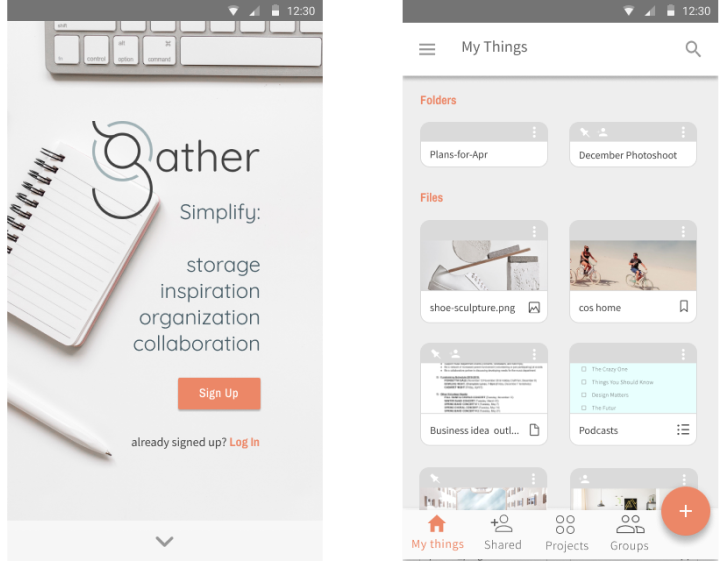
final product
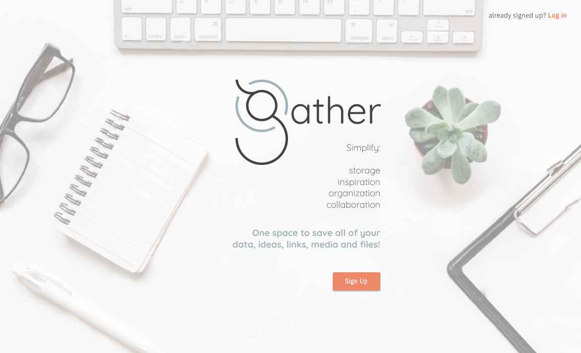
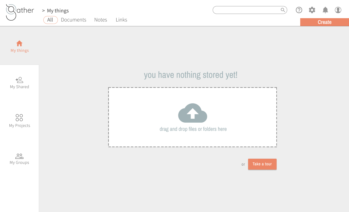
Building on all of these iterations and considerations, I reached my final design:
Desktop Prototype | Mobile Prototype
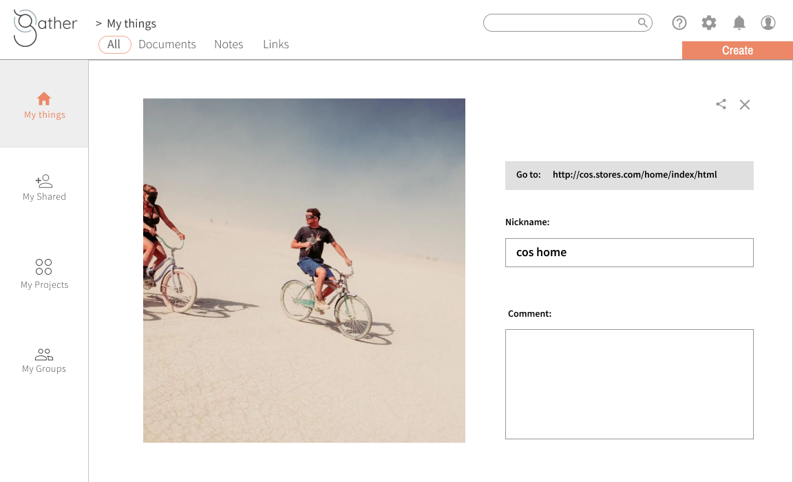
Final Desktop Screens:
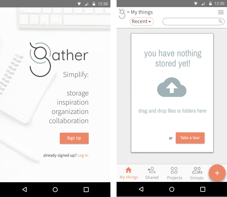
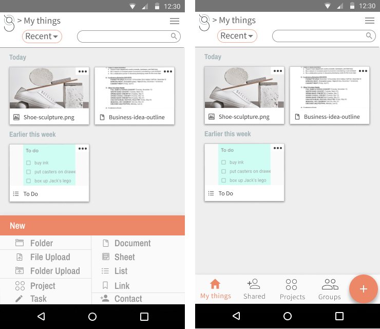
Final Mobile Screens:
Conclusion
conclusion
Through many hours and iterations, there were valuable lessons learned at every step in the process. Some key takeaways:
- Putting ideas and designs out there, testing early and often is very beneficial for honing in on what works and what doesn’t.
- Though aesthetic considerations matter, form must serve function. Superfluous visual elements, no matter how aesthetically pleasing, can become a distraction.
- Effective design hinges on creating a delicate balance between offering sufficient information and too much information. At the beginning of my design process, I was loosely adhering to the idea that humans have a capacity for keeping ~7 bits of information ‘in the head’ short term (this is known as Miller’s Law)
- In my effort to offer more functionality up front however, I was erring on the higher side rather than the lower side of that approximation. My user testing and feedback confirmed it was better to organize in chunks of ~5 (the lower end of the formula) and sacrifice some upfront functionality.
- Give ideas and images room to breathe!
- Scrolling and drilling down are not necessarily the enemy. Often it’s better to have only a handful of readily visible options, essentially narrowing your focus so as to prioritize your attention and resources.